Game Design Principles
Assignment 1 - Portfolio of Research Tasks [10%]
Video games are a digital type of ‘game’, which are commonly categorised by genre and perspective. Perspective refers to the positioning of the camera; For instance, a ‘third-person’ video game would involve the camera being positioned behind the character. Video games also consist of a large category of genres and subgenres, which can lead to a complex variety in the different types of game available. However, video games will usually share some similarities, or recurrent themes that work well for the typical demographic of consumer, which are known as tropes. In this report, I will be taking a look at the ‘Mini-map trope’, outlining aspects such as how this component differs across genres, as well as how a mini-map can have a positive or negative effect on the user depending on its implementation and design.
The ‘Mini-map trope’ is one that is used in many different genres. A ‘Mini-map’ is a component of the HUD of a video game, and it serves as a miniature version of the full map of the game level. In most examples, this feature will be displayed on the corner of the screen, scaled to be visible enough but careful to not obscure the video game screen too much. Furthermore, the mini-map will frequently feature some additional information, such as the position of the player, enemies and points of interest. The purpose of mini-maps are to aid the player in traversing the game world, and completing the objectives of the game. Despite this, sometimes mini-maps can be poorly designed, with hard to follow layouts of the game world, or perhaps too many icons which become a distraction as opposed to a helpful tool.

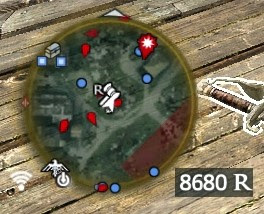
The example shown above is from the video game: Counter Strike: Global Offensive (2012). The video game is categorised as a 'First Person Shooter' (FPS), where the player is in a team of five, versus five enemy players. Being a team-based game, it is crucial to know the location of your teammates, and the mini-map design easily accommodates this by assigning each teammate a randomly coloured dot, which is then visible on the mini-map so that the player can easily identify their locations. Furthermore, lots of other information is provided to the player, such as the layout of the game level, the spawn locations, objectives and more. The mini-map also matches position and orientation with the player, helping the player stay aware of their position. However, some information is deliberately restricted to each team, such as the location of the enemy players, which would lead to tedious and predictable game play. I would argue that this is an example of a good mini-map, as the developers have clearly aimed to only include information which is absolutely necessary to the user, and does not over complicate the map. Despite this, I would still criticise the mini-map for being a bit hard to follow, as it is not possible to see depth in the mini-map where perhaps the game world is higher/lower in certain areas for instance.

The example shown above is from the video game: Counter Strike: Global Offensive (2012). The video game is categorised as a 'First Person Shooter' (FPS), where the player is in a team of five, versus five enemy players. Being a team-based game, it is crucial to know the location of your teammates, and the mini-map design easily accommodates this by assigning each teammate a randomly coloured dot, which is then visible on the mini-map so that the player can easily identify their locations. Furthermore, lots of other information is provided to the player, such as the layout of the game level, the spawn locations, objectives and more. The mini-map also matches position and orientation with the player, helping the player stay aware of their position. However, some information is deliberately restricted to each team, such as the location of the enemy players, which would lead to tedious and predictable game play. I would argue that this is an example of a good mini-map, as the developers have clearly aimed to only include information which is absolutely necessary to the user, and does not over complicate the map. Despite this, I would still criticise the mini-map for being a bit hard to follow, as it is not possible to see depth in the mini-map where perhaps the game world is higher/lower in certain areas for instance.

Another example of a mini-map design comes from League of Legends (2009), a Multiplayer 'Online Battle Arena' (MOBA) video game. This is an example of a mini-map which does not follow the player's location, but instead shows the full map as a miniature version. League of Legends is also a team-based game, therefore being able to view each teammate at all times is crucial in this video game. In addition, the mini-map offers a critical game mechanic to the team; Each teammate has the ability to post one of several icons on the mini-map, which is visible to each player on the same team. One of which could be a warning icon, which signals all teammates to retreat from that point. This is a prime example of where the mini-map is not just aiding the user in traversing the game world, but enables the user to interact with it as well, leading to a more engaging feature of the game.

So far, both mini-map examples shown have been necessary to the competitive aspect of the video game. But for non-competitive games, there is much debate over the use of mini-maps, as they cause the player to focus too often on the mini-map, and less on the game world. "They distract from the game you’re playing and frequently offer information that you don’t even need. They draw your eyes away from the world you’re exploring" (Hamilton, 2019). Assassin's Creed IV: Black Flag (2013) is considered to be a very poor example of a mini-map. Firstly, for a video game of the action-adventure game genre, the mini-map causes a large distraction to the user, causing them to focus on it rather than the adventure aspect of exploring the game world instead. Moreover, the mini-map is not very easy to follow, with lots of icons covering the mini-map to the point at which the user can hardly view their own player icon, as well as an unclear layout of the game world. This can lead to a more tedious and unsatisfying experience with the game.

Another popular example of an arguably poor mini-map design comes from Grand Theft Auto V (2013). The main problem with this mini-map is how convoluted and cluttered this mini-map is, with dozens of icons spread across a small area of the screen. The game is also an action-adventure genre of game, which offers a very large and varied game world with many different activities and features available to the user. However, Rockstar Games make the mistake of trying to add too much to their mini-map; Unless you are within relative proximity to the location of the icons, they will not appear, but the mini-map still ends up very cluttered as there are too many icons present, especially since most of these icons are not commonly used by the player. In addition, the use of a mini-map somewhat inhibits the potential immersive experience that comes with exploring what is considered to be a very well designed game world, as the user is primarily focused on getting from one objective to the next with the use of an in-game GPS, which highlights the route to the next objective.

Old School Runescape (2013) is categorised as a fantasy MMORPG (Massively multiplayer online role-playing game), which also features a conventional example of a mini-map. This video game is particularly unique as it features a 'Point-to-click' game mechanic, which - instead of more conventionally using the keyboard to move the character - the user moves by clicking at a target destination in the game world with the input from the mouse. It could be considered a poor mini-map design, as it is too cluttered with unnecessary information, and could be seen as limiting the exploration experience. However, I would argue that these icons and the mini-map itself are necessary to traverse such a large and detailed game world, and the icons that are displayed are specifically chosen to aid the user, where the task could be considered tedious or too difficult without them. This is an example of a mini-map which can still be effective despite having many icons present at once, highlighting how the game developer needs to be critically thinking about what icons are present and if their presence benefits the user. What's more is that the mini-map compliments the game mechanic of 'Point-to-click' as you can also click on the mini-map to move, which is easily considered more convenient to the user as you are able to click further on the mini-map than you can in the actual game world.

To conduct a more in-depth analysis of the trope, I developed a working example of a basic mini-map design in the Unreal Engine. Mini-maps work by placing a camera above the character and tracking its movement, which is then shown on a mini-map. Therefore the first step is to add a 'SpringArm' component to the Blueprint of the character, followed by a 'Scene Capture Component 2D'. This creates a camera which tracks the character from above as you can see in the above image.


Another popular example of an arguably poor mini-map design comes from Grand Theft Auto V (2013). The main problem with this mini-map is how convoluted and cluttered this mini-map is, with dozens of icons spread across a small area of the screen. The game is also an action-adventure genre of game, which offers a very large and varied game world with many different activities and features available to the user. However, Rockstar Games make the mistake of trying to add too much to their mini-map; Unless you are within relative proximity to the location of the icons, they will not appear, but the mini-map still ends up very cluttered as there are too many icons present, especially since most of these icons are not commonly used by the player. In addition, the use of a mini-map somewhat inhibits the potential immersive experience that comes with exploring what is considered to be a very well designed game world, as the user is primarily focused on getting from one objective to the next with the use of an in-game GPS, which highlights the route to the next objective.


To conduct a more in-depth analysis of the trope, I developed a working example of a basic mini-map design in the Unreal Engine. Mini-maps work by placing a camera above the character and tracking its movement, which is then shown on a mini-map. Therefore the first step is to add a 'SpringArm' component to the Blueprint of the character, followed by a 'Scene Capture Component 2D'. This creates a camera which tracks the character from above as you can see in the above image.

Once a camera is created, it needs to output the camera data, and this is done with the use of an advanced asset known as 'Render Target' in Unreal, which serves as a texture. The output of the camera is to be assigned to this new asset. This now displays the character on the left of the image above. However, what this is currently doing is rendering a view of the game world twice, once for a mini-map and once for the game itself. This is not easy to follow, unlike the previously viewed examples, as the character or enemies perhaps would appear too detailed on a small space of the screen. The next step is to take this view and develop it into a more traditional mini-map. This requires us to create a material, and setting the material domain to a 'User Interface'.

After this, I have created a new 'Widget Blueprint', which is part of the user interface. Upon opening the Blueprint editor, I have dragged the 'Image' option from the left and placed it on the screen, setting the size of the shape to 256 pixels by 256 pixels, following the conventional shape of a mini-map whilst also ensuring it is not too large of a size. I can then select my Mini-map material on the right, and the camera data appears correctly.

In order for the mini-map to be displayed on the screen, the widget needs to be added to the viewport. I have opened the 'Level Blueprint' editor and added the following nodes in the event graph. Initially the widget is called once the game has started playing, which is then stored as a variable by using the 'Promote to variable' option. Now the mini-map can be added to the viewport with the use of an 'Add to viewport' node.
I have uploaded a short demonstration of the mini-map from this point. One of the problems is that the mini-map is rotating with the character, something I dislike for a third-person perspective as the movement of the character causes the mini-map to rotate too much. In addition, the mini-map is currently in perspective mode, which can lead to glitches in the mini-map, and is not a true perspective of a mini-map.


The first issue I fixed was the rotation of the mini-map, which was easily done by locating the 'SpringArm' created earlier under the character Blueprint and deselecting all rotation options, seen in the first image above. In addition, I located the camera which captures the character from above, and changed the projection type from Perspective to Orthographic.
After these two relatively simple changes, I was pleased with the result. However, I was unsatisfied with the mini-map scale, as it did not capture enough of the game world. To solve this, I went back to the camera and doubled the orthographic width from 512 to 1024, the results of which can be seen below.


Bibliography:
Valve. (2012). Counter Strike: Global Offensive. [Online Game]. PC.
Riot Games (2009). League of Legends. [Online Game]. PC.
Hamilton, K. (2017). Video Game Mini-Maps Might Finally Be Going Away. [Online Article] Kotaku. Available at: https://kotaku.com/video-game-mini-maps-might-finally-be-going-away-1820011897 [Accessed 26 Oct. 2019].
Ubisoft. (2013). Assassain's Creed IV: Black Flag. [DISC] Playstation 4.
Rockstar Games. (2013). Grand Theft Auto V. [Online Game]. PC.
Jagex. (2013). Old School Runescape. [Online Game]. PC.

After this, I have created a new 'Widget Blueprint', which is part of the user interface. Upon opening the Blueprint editor, I have dragged the 'Image' option from the left and placed it on the screen, setting the size of the shape to 256 pixels by 256 pixels, following the conventional shape of a mini-map whilst also ensuring it is not too large of a size. I can then select my Mini-map material on the right, and the camera data appears correctly.

In order for the mini-map to be displayed on the screen, the widget needs to be added to the viewport. I have opened the 'Level Blueprint' editor and added the following nodes in the event graph. Initially the widget is called once the game has started playing, which is then stored as a variable by using the 'Promote to variable' option. Now the mini-map can be added to the viewport with the use of an 'Add to viewport' node.
I have uploaded a short demonstration of the mini-map from this point. One of the problems is that the mini-map is rotating with the character, something I dislike for a third-person perspective as the movement of the character causes the mini-map to rotate too much. In addition, the mini-map is currently in perspective mode, which can lead to glitches in the mini-map, and is not a true perspective of a mini-map.


The first issue I fixed was the rotation of the mini-map, which was easily done by locating the 'SpringArm' created earlier under the character Blueprint and deselecting all rotation options, seen in the first image above. In addition, I located the camera which captures the character from above, and changed the projection type from Perspective to Orthographic.
After these two relatively simple changes, I was pleased with the result. However, I was unsatisfied with the mini-map scale, as it did not capture enough of the game world. To solve this, I went back to the camera and doubled the orthographic width from 512 to 1024, the results of which can be seen below.
This change in the width helped a lot in my opinion, enabling the user to view more of the game world and follow it easier. I would have extended this view further, but for the purpose of experimenting with mini-maps in this testing environment, this was not necessary.
I now want to turn this mini-map into a more traditional version, one with markers and icons rather than the actual game world in the top left corner of the screen. For this I am going to replace the main character in the scene with a simple marker I have created in Adobe Illustrator. To do this, the main character needs to not show up on the mini-map that I have created, and this is achieved by locating the camera I had created and disabling the 'Skeletal Meshes' option.

Since the main character no longer exists on my mini-map, I can now use this simple marker I have created instead. However, before I can do that, I need to import this asset and then create a sprite. Once this process is completed, I can then add a 'PaperSprite' and select my recently created sprite, which now appears above the character. It should be noted that the 'PaperSprite' should not be attached to the 'SpringArm' as otherwise the sprite would not rotate with the character. Finally, I have checked the property 'OwnerNoSee' which means that the icon will not show when viewing the character, otherwise the icon would be visible above the character which is not suitable.
Here is the final showcase of my mini-map example. The mini-map is very basic, featuring an orthographic view of the game world which follows the player. The player rotating does not affect the map, but it does change the icon that represents the player in the mini-map. A way to improve this mini-map would be to replace the game world displayed in the mini-map with an actual map, so that the mini-map would be clear to the user. In comparison to the previously analysed examples of mini-maps, I would argue that mine is very simplistic, and does not over-complicate itself with unnecessary icons. However, (if it were to feature a proper game world) the mini-map would be hard to follow as it does not actually resemble a proper 'map'. In its current state, it is simply projecting the game world from a top-down view, and does not clearly define the game world pathways and routes as most conventional examples of mini-maps do.
In summary, the mini-map trope is featured in one of the four corners of the screen, conventionally displaying a rough layout of the game world, followed by icons to represent the user and enemies/allies. Their purpose is to aid the user in traversing the game world, though not all mini-map designs achieve this goal, with some poor designs having a negative impact on the user, leading to frustration and potentially serves as a distraction from perhaps being immersed in the game world instead. Despite this, most examples do have a positive impact on the user, with some examples serving as an integral part of the game, and others allowing activities or tasks being made much less difficult as opposed to not having a mini-map. Ultimately this comes down to how well the mini-map design has been developed, and whether the implementation has been well thought out or not. Through my own experimentation of this trope, I would argue that it is easily achievable to make a clear and easy-to-follow mini-map, though the inclusion of certain features will vary across different game genres and types, and this is up to the developer to decide if this will benefit the user or cause a negative impact. Furthermore, the inclusion of a mini-map should be debated, as some games would be arguably improved with the removal of the mini-map. Therefore, I would conclude that although mini-maps can have a positive impact on the user, certain included features can cause the mini-map to have a negative effect instead, whether it is the inappropriate inclusion of a mini-map or unnecessary features that are unhelpful and distracting.
Bibliography:
Valve. (2012). Counter Strike: Global Offensive. [Online Game]. PC.
Riot Games (2009). League of Legends. [Online Game]. PC.
Hamilton, K. (2017). Video Game Mini-Maps Might Finally Be Going Away. [Online Article] Kotaku. Available at: https://kotaku.com/video-game-mini-maps-might-finally-be-going-away-1820011897 [Accessed 26 Oct. 2019].
Ubisoft. (2013). Assassain's Creed IV: Black Flag. [DISC] Playstation 4.
Rockstar Games. (2013). Grand Theft Auto V. [Online Game]. PC.
Jagex. (2013). Old School Runescape. [Online Game]. PC.